From the desk of Laurel Ann Nattress:
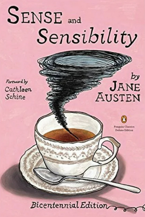
For two hundred and one years readers have had the pleasure of reading Jane Austen’s first published novel, Sense and Sensibility. For the bicentenary celebration last year, Penguin Classics issued this new edition with an introduction by Cathleen Schine (The Three Weissmanns of Westport) and cover illustration by Audrey Niffenegger (yes the author of The Time Travelers Wife is also an artist).
The cover shows us a tempest in a teacup. While I love the design, I’m not sure that it exactly mirrors the action in Sense and Sensibility. The phrase tempest in a teacup, or teapot, has a slightly derogatory implication, like making a mountain out of a molehill. I personally think that Austen’s drama is not puffed up and only her heroine Marianne Dashwood is exaggerated (on purpose) to show her overly romantic personality. But, that’s just me.
Elinor could not be surprised at their attachment. She only wished that it were less openly shewn; and once or twice did venture to suggest the propriety of some self-command to Marianne. But Marianne abhorred all concealment where no real disgrace could attend unreserve; and to aim at the restraint of sentiments which were not in themselves illaudable appeared to her not merely an unnecessary effort, but a disgraceful subjection of reason to common-place and mistaken notions. – Sense and Sensibility, Ch 11
For those who have not had the pleasure yet of reading Austen’s tale of two divergent sisters and their financial and romantic challenges, what are you waiting for?
5 out of 5 Stars
BOOK DESCRIPTION
- Sense and Sensibility, by Jane Austen
- Penguin Classics (April 5, 2012)
- Trade Paperback & eBook (368) pages
- ISBN 978-0143106524
AMAZON | PUBLISHER | ADD TO GOODREADS
We were gifted a copy of the book from the publisher. Cover image courtesy of Penguin Classics © 2011; text Laurel Ann Nattress © 2012, austenprose.com, an Amazon affiliate. No AI: material on Austenprose.com may not be used in datasets for, in the development of, or as inputs to generative AI programs. Last update 14 February 2024.
If you enjoy the content on Austenprose.com, please like, comment, share, and subscribe to receive email notifications of new posts.
Discover more from Austenprose
Subscribe to get the latest posts sent to your email.

Not a fan of the cover, but love the book! :) Happy 201, S&S!
LikeLike
Am I unfairly carry if I think maybe Niffenegger stick with writing as I don’t see how her tempest in a teacup has anything to do with S&S. Meow.
LikeLike
Catty. Not carry. Eeeesh. Again auto correct not helpful.
LikeLike
I confess to being a fan of most film adaptations of Austen’s books, largely due to her plots, vivid characters and insight into society and family. But it’s her prose that trips me up incessantly. The same is true of my feelings for E.M. Forster. Still, I’ve slogged through one of my favorites, “Sense & Sensibility”, mainly to see if I missed anything. I practically ripped the book in half trying to decipher Austen’s occult and maddening description of the problematic inheritance that causes all the problems! I think I’ll stick to my favorite adaptation by Ang Lee and Emma Thompson, with the brilliant Kate Winslet and crew! But if anyone knows of a trimmed-down version of this novel, please let me know. I read “War and Peace” in one night, then compared it to Stendahl’s “The Red and the Black”, but “S&S” just made my head spin!
LikeLike
Hi Vercetti2, have you tried an annotated edition of S&S? There are several out there that I buy them just to read the notes and annotation.
Early nineteenth century prose can be challenging. The first time I read Pride and Prejudice I was baffled by some of the terms and phrasing. You are not alone. You do become accustomed to it after a a few chapters, and it does help tremendously if it is annotated.
Here are three annotated editions I have found very helpful and enlightening:
The Annotated Sense and Sensibility, by David M. Shapard
Sense and Sensibility (The Jane Austen Bicentenary Library), by Jane Austen, annotated by Margaret C. Sullivan
Sense and Sensibility–Annotated, with Commentary (Literature in Its Context), by Jane Austen, edited by Richard Fadem
I hope this is helpful.
LikeLike
Sense and Sensibility is truly a classic. The way it highlights different shades of human character! And the simplicity of Elinor is simply enticing.
LikeLike
I kind of like this cover…not because it’s particularly relevant to the plot or tone of the novel, but because I always like it when the covers of classics move away from the “serious painting, serious font” model. At least it’s different, you know?
(It’s going to be dated in about half a second, though.)
LikeLike