 DESIGN
“Tell your sister I am delighted to hear of her improvement on the harp; and pray let her know that I am quite in raptures with her beautiful little design for a table, and I think it infinitely superior to Miss Grantley’s.” Caroline Bingley, Pride & Prejudice, Chapter 10
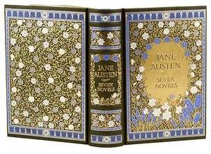
Recently, I posted an announcement of the new deluxe edition of Jane Austen: Seven Novels that hit Barnes & Noble stores in January. This beautiful edition is selling like hotcakes and is now into the third printing after less than one month! That’s really hot in the classic book selling world. Great news for the suits and skirts at publishing headquarters, and further proof that our favorite authoress is the ‘power hitter’ that her public always knew she was. La!
As a bookseller, this edition is such an easy sell; a no brainer really. It just pops right off the table at my customers. There are other handsome editions on the market at the moment, so why is this one so special? Well, let’s check that out.
The designers Elizabeth Traynor and Jo Obarowski really did their homework, and it shows. This volume is visually unique from the others in Barnes & Noble’s classic warhorse series that feature treasured authors such as Dickens and Shakespeare’s unabridged works. The series quality and presentation echo the fine bindings that you would find in say, Mr. Darcy’s extensive library at Pemberley. However, this new edition is hip, pushing the ‘classic leather binding’ envelope by combining all the desirable elements of traditional book binding with the colorful and embellished designs popular at the turn of the century. The results are stunning, and the buying public has voiced its approval by snapping them up.
So how did this new design come about, and why the change? Here is a look at how the new cover evolved when Barnes & Noble art director Jo Obarowski and illustrator Elizabeth Traynor combined efforts to design the new edition.
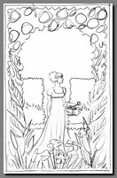
Their preliminary design concepts included a design of pure ornament similar to some of the current gold embossed editions in the series. Other concepts explored were more figural and scenic, and over a dozen were evaluated. Here are some of the early conceptual sketches.


Rough concept sketch Sketch 1 Formal with Privet Sketch 5 Informal Countryside
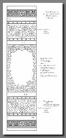
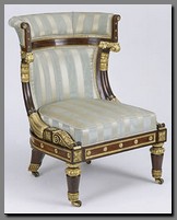
Ms. Traynor was inspired by the design aesthetics of the English Picturesque gardening movement, Regency era architecture and Empire furniture design of Jane Austen’s lifetime. She investigated many online web sites, historical resource books and vintage wallpapers to pull together her inspirations for possible designs. She was particularly interested in Regency era fashions with their classical lines influenced by Greek and Roman designs, embellished fabrics and floral patterns. Here are a few of her favorite examples.


Empire Chair Regency Wallpaper Fashion Plate
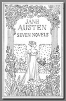
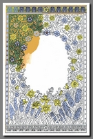
Regency research is apparent in the early cover sketch of a woman in a formal privet garden framed by flowers. This evolved into a pure floral theme of iconoclastic English flowers of cornflowers, daffodils and roses that were used in the final design. Traditional acanthus leaf and egg-and-dart motif ornamentation were added to frame the floral center which continues on the spine and back cover.

Sketch 6 Flowers all Around Sketch 1, Final Concept Final Sketch, Austen Spine
The final cover sketch that evolved from the combined influences is both finely detailed and aesthetically pleasing. With the addition of color, the concept from the illustrator was complete. Art director Jo Obarowski then selected the type face for the cover and spine, designed the title page, and selected the floral end papers.


Final Cover Sketch Cover Color Study Cover Transparent Layers
 In retrospect, illustrator Elizabeth Traynor and art director Jo Obarowski were inspired by Jane Austen’s work and times to create a book cover and interior that reflects both historical and classical influence resulting in stunning craftsmanship and artistic beauty. Available through Barnes & Noble Booksellers. ISBN 9781435103191
Discover more from Austenprose
Subscribe to get the latest posts sent to your email.

Fascinating analysis of a book design. Thanks for showing the development of the book from the conceptual sketches and through the finished book.
LikeLike
jo obarowski is great at cover designs im a fan of his work on the edgar allan poe cover,its very good.
LikeLike